Amongst the varied tasks I have been working on for the mod "For Hire" I have UV mapped and textured a character model. Whilst I didn't make the mesh for the model seen here, I unwrapped the model myself onto 5 separate texture maps.
I took the time to appropriately scale the UV coordinates in the most efficient manner I could, since extraneous detail on textures is a burden for users with lower end machines (and in my opinion, rather unprofessional).
After UVmapping the model I painted the textures entirely from scratch in Photoshop. This was a first for me, since previously I had relied entirely on phototextures.
Please note, the textures are deliberately downscaled in this preview.
Monday 22 March 2010
Thursday 4 February 2010
Sound design work
In addition to creating maps and models, I also miscellaneously work as a sound designer. Most of my work to date has simply focused on making firearm audio for existing games, though I have also made various ambient sound effects for a variety of mods.
To make sounds I use either a simple microphone or a camcorder, depending my need.
Once I have obtained the audio I desire, I then mix this in Goldwave.
Examples of my work can be found as sound packs on FPSBanana:
Modern Weaponry soundpack
World War 2 weapon soundpack
Mauser rifle soundpack
Counter Strike Source default audio remixed
P90 submachine gun
Heart of Evil Napalm Edition map work
I worked on this Half-Life 1 mod quite a while ago now, as a mapper and modeller.
It has a very stylized look (particularly since I didn't really research real world environments).
Most of the layouts were originally designed by a guy called Nathan Ruck, whose layouts I roughly followed when making the maps for this mod. When re-designing the maps, I sought the opinions of other players to guide the design of these maps.
I also worked on various NPC models: making the webbing for soldiers, and the head of every character in the game.
Sunday 17 January 2010
"For Hire" map work
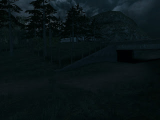
Early in 2009 a friend of mine asked me if I would be interested in joining their mod project, one which would be striving for a realistic portrayal of various areas in California.
He told me the exact type of areas he wanted produced, and how these would all fit together. Firstly he wanted a "hub area" where players would begin the game, and could select missions from.
We discussed which game engine we would like to do this with - initially the Goldsource engine, though we eventually settled on the Source engine since it allowed for easier terrain creation, and generally seemed to be an easier engine for mod teams to use.
I quickly set about searching for photographs of rural California, which we wanted to depict in this first map area. These photographs proved extremely useful for quick architectural inspiration (when previously I had made buildings from my own imaginary designs), and thus I was able to quickly create some early screenshots to show off the mod - something that proved useful for drumming up interest in the project early on.
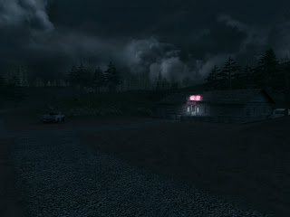
Soon into making the map, I began to feel the limitations of the Source engine when it came to making large outdoor areas, which frustratingly forced me to limit the size of areas depicted (or in some cases reduce detail levels to optimize the map). I did not want to stray from my plans, so I kept as close as possible to those as I could.
Once the terrain and architechture for the map were finished, I spent a lot of time fine tuning the lighting. One part of my design brief was to set the map at night - something that was proving awkward with the default light entities in the Source engine, which bizarrely would not let me set darkness beyond a certain value.
Thus I turned to colour correction to darken the map, wash out all the RBG colours, and overlay a blue tint.
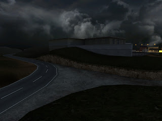
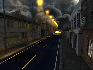
When that first "hub map" was largely completed I began work on a second map for the mod, which would feature sequentially as the final map of the mod. I designed a large, open environment which players would need to navigate through to reach their final objective.
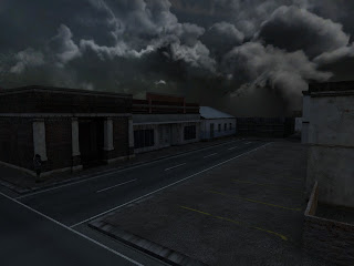
The plan for this map was to transport players from rural California towards the beginnings of suburbia.
Creating the suburban area was quick and easy to do, but creating the large open rural environment took a great deal of time - particularly since the area I had envisioned was about ten times the size of the average Source engine map, and large areas of terrain are cumbersome to make in the Source engine.
To ensure that players would have the illusion of walking through a very large open environment, I placed yet more terrain within the skybox. Use of the skybox also allowed me to divide up "VIS" areas, since I could push players through small bottlenecks to get from one VIS area to the next, all the while maintaining the illusion of a an extremely open environment.
This map is still a work in progress, though it should be completed soon. I shall be adding foliage, chokepoints, and colour correction. I intend to display two colour correction effects - one darkening effect for the rural area, which eventually fades to a monochrome orange for the suburban lighting.
He told me the exact type of areas he wanted produced, and how these would all fit together. Firstly he wanted a "hub area" where players would begin the game, and could select missions from.
We discussed which game engine we would like to do this with - initially the Goldsource engine, though we eventually settled on the Source engine since it allowed for easier terrain creation, and generally seemed to be an easier engine for mod teams to use.
I quickly set about searching for photographs of rural California, which we wanted to depict in this first map area. These photographs proved extremely useful for quick architectural inspiration (when previously I had made buildings from my own imaginary designs), and thus I was able to quickly create some early screenshots to show off the mod - something that proved useful for drumming up interest in the project early on.
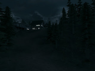
Soon into making the map, I began to feel the limitations of the Source engine when it came to making large outdoor areas, which frustratingly forced me to limit the size of areas depicted (or in some cases reduce detail levels to optimize the map). I did not want to stray from my plans, so I kept as close as possible to those as I could.
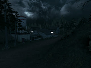
Once the terrain and architechture for the map were finished, I spent a lot of time fine tuning the lighting. One part of my design brief was to set the map at night - something that was proving awkward with the default light entities in the Source engine, which bizarrely would not let me set darkness beyond a certain value.
Thus I turned to colour correction to darken the map, wash out all the RBG colours, and overlay a blue tint.
When that first "hub map" was largely completed I began work on a second map for the mod, which would feature sequentially as the final map of the mod. I designed a large, open environment which players would need to navigate through to reach their final objective.
The plan for this map was to transport players from rural California towards the beginnings of suburbia.
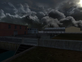
Creating the suburban area was quick and easy to do, but creating the large open rural environment took a great deal of time - particularly since the area I had envisioned was about ten times the size of the average Source engine map, and large areas of terrain are cumbersome to make in the Source engine.
To ensure that players would have the illusion of walking through a very large open environment, I placed yet more terrain within the skybox. Use of the skybox also allowed me to divide up "VIS" areas, since I could push players through small bottlenecks to get from one VIS area to the next, all the while maintaining the illusion of a an extremely open environment.
This map is still a work in progress, though it should be completed soon. I shall be adding foliage, chokepoints, and colour correction. I intend to display two colour correction effects - one darkening effect for the rural area, which eventually fades to a monochrome orange for the suburban lighting.
Saturday 16 January 2010
ZM_saxon
My second attempt at making a Counter-Strike map was considerably more complicated than the first. I wanted to do something altogether different to my previous work, and settled on the idea of creating a car park in mid-western America.
I designed each level of the car park, linking the sections together. I took care to design the separate levels differently, rather than copying and pasting the same layout over and over.
Once I began creating the map in Hammer, I found it difficult to distinguish the separate levels of the carpark in the 2D view planes. Thus it became useful to group the separate levels of the carpark, allowing me to hide layers I wasn't working on at a particular moment.
It took a month to complete the basic architechture for the map, but once this was done it was easy to add in details, props and lighting.
Having done this, I wanted to add two things that would set my map apart from other maps: the first being subtle use of colour correction to tone down certain colours, while increasing other colour values; the second being map specific player textures.
I designed each level of the car park, linking the sections together. I took care to design the separate levels differently, rather than copying and pasting the same layout over and over.
Once I began creating the map in Hammer, I found it difficult to distinguish the separate levels of the carpark in the 2D view planes. Thus it became useful to group the separate levels of the carpark, allowing me to hide layers I wasn't working on at a particular moment.
It took a month to complete the basic architechture for the map, but once this was done it was easy to add in details, props and lighting.
Having done this, I wanted to add two things that would set my map apart from other maps: the first being subtle use of colour correction to tone down certain colours, while increasing other colour values; the second being map specific player textures.
Labels:
counter-strike,
hammer,
mapping,
valve,
zm_saxon
ZM_Dustpanic
This was probably the first map I "seriously" tried making for the Source engine. I wanted to create something that would look good, be fun to play, and wouldn't take long to create.
As with all good map designs, the layout came first. The layout for the map was initially inspired by a map called "zm_lila_panic", a map that I felt to be considerably lacking in balanced gameplay and wanted to correct. However as I developed my design on paper, it soon became clear that my map had little in common with the original inspiration and would be deserving of some new title, the map I had drawn on paper was very much my own.
At the beginning of the design phase I had decided that I wanted my map to resemble the classic counter-strike map "Dust". It was my hope that building something that matched the graphical quality of "Dust" would prove alluring to players.
Furthermore, I knew that the graphical style of "Dust" would be easy for me to replicate (particularly due to the abundance of prop models available) and would prove quick to develop.
The map took a mere week to develop, and following release became a popular map on custom map servers.
The map can be downloaded from the following link:
http://www.fpsbanana.com/maps/98247
Labels:
counter-strike,
hammer,
mapping,
valve,
zm_dustpanic
Subscribe to:
Posts (Atom)